Needs More JPEG
When it comes to images in print — specifically photos, the difference between screen resolution and print resolution is very important to understand. We are often asked to pull logos from websites or images from Facebook for print pieces, but more often than not, the resolution is simply not high enough to render a decent […]
Say What You Need to Say
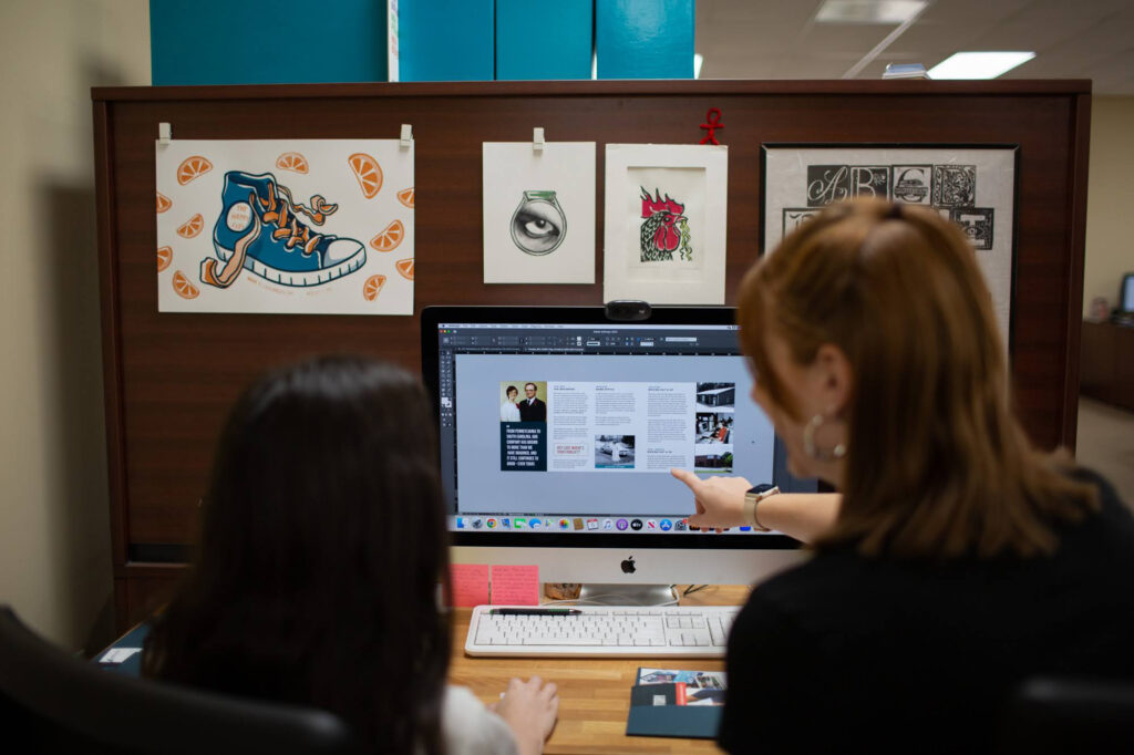
Regardless of the specific goals of an organization, it’s safe to say that the goal of any piece of communication is to convey information. That said, the overall success of a piece can, at least in part, be measured by how well the intended information is conveyed. Whether or not it has cool layouts, catchy […]
Knowing Your Tri-Fold
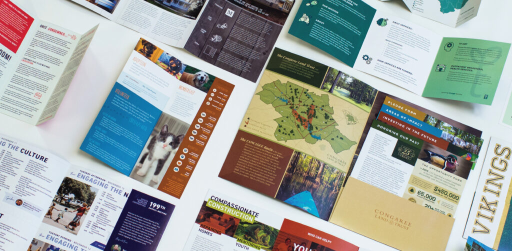
When making a tri-fold brochure, there are a few things to keep in mind — where your front and back panels will sit, and how to position content to arrive at an even margin. Common Misconception “Since my brochure folds into thirds, I need to have equal spacing in between each panel and at the […]
Visual Hierarchy: Leading the Eye
What is visual hierarchy? Designers are often asked to make things “pop.” Some want brighter colors, some want bigger text, but at the core it typically just means added emphasis on a particular item — or at worse, all items. The problem therein, is that you can’t expect to make everything “POP!” because if everything […]
Help! My Files Aren’t Bleeding!
Have you ever heard the term full bleed? No, we’re not talking Godfather level bodily harm, the term full bleed in print refers to color that runs all the way to the edge of the paper. Knowing how to set up a bleed and having your files ready to print can save a lot of […]