Serifs, Sans, & Scripts, Oh My!

Eryn Rolison
| 5 min read
As we talked about in another post, typography is a form of art. It is always a challenge to choose the right typeface for the right situation. Our goal is to help you understand what the differences are so that you can easily recognize them and make better use of type when you are designing.
Typefaces can be divided into many categories, but at a top level there are three primary classifications of typography fonts: serif, sans serif, and script. There are also various sub-sets and even some crossover typefaces that help us further differentiate styles, which we will cover as well.
Let's get to it with some typography anatomy!
Serif
Serif typefaces are easy to spot because they have small lines attached to the end of each stroke in the letters and symbols. Those extending lines are called serifs and they join the strokes with a curve.
Playfair is one example of a serif typeface. If you look at top and bottom of the lowercase “l” in the image below, you can see that there is a curve joining the main stroke of the letter to the tiny lines on the top and the bottom.

When to use it
Serif typefaces are considered by many to be the easiest to read (although this is often debated) because the serif is designed to accentuate the imaginary line (called the baseline) on which the text is sitting.
Decorative serifs like Playfair are often used for headers, while more traditional serifs like Garamond, Caslon, and the ever-popular Times New Roman, are often used for body copy (the main written content in a design). We recommend using those when you want a more traditional look.
Slab serif
Slab serifs are a sub-set of serifs, but there is enough distinction in look that it is worth differentiating. Unlike regular serifs, which curve to a tapered edge, slab serifs are more blunt and block-like, extending at a fixed stroke.
Depending on the typeface, the end of the serif may be flat, as seen in Museo, or rounded as seen in Courier.


When to use it
Slab serifs can serve a variety of functions. Usually, the typefaces with thicker, more block-like serifs are used in headers while those with a thinner stroke may be used for regular body copy.
Slab serifs can sometimes connote a techy feel, as they are regularly used in computer programming. They can also have a vintage look, as many are modeled after the common typewriter.
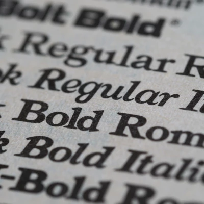
Sans serif
Sans means “without,” therefore, sans-serif literally means “without” serifs. The strokes in the letters and symbols do not have the same embellished look and typically have less variation in stroke width.

When to use it
Designers continue to argue over which is easiest to read in print, serifs or sans, but sans serif typefaces remain the primary go-to for legibility on screen. They are easily the most versatile form of type, existing well in both headers and body copy, but they do have a more modern feeling.
Script
The last main category of typefaces is script. Script is derived from handwriting and often has the same curved, continuous stroke as handwritten text and can be found with or without connecting letters. Script typefaces are most commonly seen in headlines and logos because of their unique shapes, but can also be used for callouts and to create emphasis and visual interest in your design.

When to use it
The same features which make Script attractive in small doses also makes them difficult to read in large blocks of text. That is why we reserve Script for special occasions, and would not recommend setting your body copy in Script.
Hand-drawn
There is one other genre of type worth mentioning because it is widely used and currently very popular. Hand drawn text, which can be serif, sans, or script, is marked by the distinguished characteristics and subtle imperfections that come from working by hand.
You typically won't find perfect curves and hard squared edges, but rather soft turns and imperfect lines.

When to use it
As with script fonts, a hand-drawn type can be a nice change of pace and a great way to call attention to something, but it should be used sparingly. For example, if you were to put an entire paragraph in this typeface, and reduce the size to a standard paragraph, you would find it very difficult to read.
The bottom line
When it comes to typefaces, there is a vast selection from which to chose. Knowing these categories helps us, as designers, choose something that fits the message you are aiming to convey.
In short, reserve specialty type for call-outs and headers only, and keep your body copy in something relatively standard.
If you decide you need help weighing your options and designing your printed piece, we are here to help!