Visual Hierarchy: Leading the Eye

Benji Mitchell
| 2 min read
What is visual hierarchy?
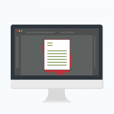
Designers are often asked to make things "pop." Some want brighter colors, some want bigger text, but at the core it typically just means added emphasis on a particular item — or at worse, all items.
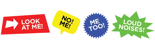
The problem therein, is that you can’t expect to make everything “POP!” because if everything pops, then nothing pops. If every bit of content has the same strength and emphasis — particularly with loud colors and large type — then nothing stands out from anything else.
Visual hierarchy is not so much about making things pop, but about leading the eye through the content. What is most important? What is secondary? What is least important?
It’s not a shouting contest, but rather a user experience in which the eye is purposefully guided through to see and interpret one bit of content before moving to the next. The danger with making things “pop” is that the eye bounces all over the page and never actually deciphers the information that is presented.
Quick tips on visual hierarchy
We are more than happy to be your go-to design team, but if you are working on something of your own, here are a few quick tips that will help make your message stand out... in a good way.
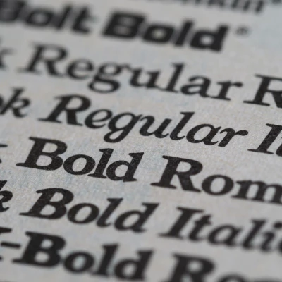
Try to limit font variation to a max of two different typefaces and 3 different sizes.
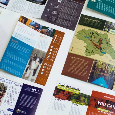
Leave enough negative space, or white space, as margin so that the eye can find the content on the page.
Avoid busy fonts that make things hard to read.
Avoid placing text over busy images.
Keep it simple.