Which Font Is Your Type?

Eryn Rolison
| 5 min read
When you sit down at your computer and start writing in Word, you most likely see one of the following on your screen: Arial, Times New Roman, or Calibri.
You may not initially put a lot of thought into which of these to use because you are more concerned with using the right words to communicate your message, but just as colors have associative emotions, typefaces also convey different feelings. Our job is to use the best typography to visually emphasize the written message we are publishing, whether it is in a magazine or on a postcard being mailed to your customers.
According to Webster...
typography is the style, arrangement, or appearance of printed letters on a page.
Although it may sound simple to just “choose a font,” typography is a very complex art — some people devote their entire career to studying and creating type. In fact, the very definition of font is even more complicated than you may think.
A font is a specific version of a designed typeface. The word font here is displayed in URW Form Italic 16-point font. This is part of the URW Form typeface, which consists of a variety of sizes and styles—terms that you may be familiar with such as regular, bold, and italic.
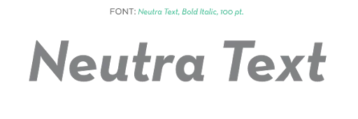
Here is another example using Neutra Text. This is a sampling of the entire typeface:
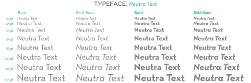
Now, here’s one of the specific fonts within that typeface:
Many people use these words interchangeably—including designers— so don’t feel like you will be wrong if you say one word or the other, but now you know the true definitions of each.
There are countless typefaces out there to choose from. Some cost money and some are free! Just like any other product, typefaces vary in quality, style, and feel. Some definitely work better for certain situations than others!
Choosing typefaces can be fun, and when you are designing your own piece it can be tempting to use lots of really exciting ones to make the design more interesting. As difficult as it can be to narrow down the options, most written communication should only have three to four font sizes and no more than two typefaces.
This helps us use the type to emphasize your message rather than letting the different styles become distracting.
Therefore, in choosing the type, we typically divide written content into four categories: headers, sub-headers, body copy, and call-outs.
Header
The header is like the headline of an article; we want the reader’s eye to start there, so it needs to stand out! The type used here is usually bigger and more interesting than anything else on the page.
This is where we can get a little more creative with the typefaces we use. Because the writing is so large, it is ok to use a typeface that is a little more intricate if it compliments the feeling of your brand and works with the overall design of your piece.
Sub-header
Sub-headers go under the header and they are used to create emphasis, but are clearly less important than the header. Oftentimes, this is the same typeface as the header but not as big or bold. There may be multiple sub-headers throughout an article and they can help organize the content and guide the viewer through the piece.
Body Copy
Body copy is the “meat” of your writing and where the important information lies. It is the smallest in size (usually from 9 to 11 points) and needs to be clean and easy to read. The headers and sub-headers are used to draw the viewer in to this point, and now the priority is clarity and comprehension.
We typically choose either a serif (a typeface with small lines attached to the end of each stroke in a letter— like Times New Roman) or a sans-serif (a typeface without those lines added—like the type on this site which is URW Form) because those purposefully designed to be easy to read in long blocks of copy.
Call-Outs
Lastly, call-outs can be used to emphasize, or "call out," specific items within the body copy such as quotes or important pieces of information. They should be used most sparingly, if at all, so as to not distract from the overall message.
With those type designations, we can begin to make type selections that will best work for the varying levels of emphasis and make sure the typographic styles match your message.
It is our job to wade through the complicated details of your design, including the typography, to ultimately make the message simple and easy to understand.
As famous designer Paul Rand said, “Design is so simple. That’s why it’s so complicated.”